Enhancing a brand to appeal to a high-end clientele
Another lackluster brand couldn’t attract the high-end clientele that its fashion-forward founder, a board-certified facial plastic surgeon, had in mind.
Dr. Jennifer Parker Porter, the founder and medical director of Chevy Chase Facial Plastic Surgery, caters to high-end clientele from all over the country. She and her team perform everything from small non-surgical procedures like laser treatments to more complex surgeries for facial reconstruction. Dr. Porter recently commissioned Spring13 to assist in giving her brand the facelift it needed.
We started by exploring what the competition was doing. We discovered tons of poorly executed websites featuring the same stock photos of women’s faces, and print ads with little attention to quality graphics. For the practice’s print pieces, we found lots of room to create a sophisticated brand mirroring what its high-end Chevy Chase clientele is looking for—a unique and memorable look.
Vibrant illustrations speak to a broad audience
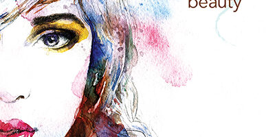
We pulled out what we felt was the main theme, “Enhance your natural beauty,” and explored different ways to illustrate the concept. Ultimately we landed on using an illustration style with a vibrant watercolor execution. By using illustrations rather than photos for the main graphics, Spring13 came up with a metaphoric style for beauty that appeals to both men and women of all ages and both genders. It also subtly speaks to the artistry involved in the work performed by the practice, which specializes in creating natural results. The illustrations allude to the perfect mix: top-tier facial plastic surgeons and the artistry at the core of the practice that’s necessary to make women and men more beautiful.
We kept the existing logo, as it was already used on office signage, and tweaked it to make it more legible, riffing on the logo’s color and “swoosh” treatment in the new print pieces we created. We also did some photo retouching to enhance the doctor’s personal library of before-and-after photos, and created the brochure with a unique fold to make it really stand out. We assisted with paper choices and managing the printing from multiple vendors, delivering the brochure, business cards, note cards and folders, all on time and on budget.
Next up we’re looking into creating unique wall coverings using the same treatment we developed for the brand to bring the updated look to the practice’s office space.